
As the number of cases of COVID-19 skyrockets globally it’s tempting to dive into the wealth of data updated daily on the internet (thanks to initiatives like the Johns Hopkins University (JHU) coronavirus map) and do some DIY tracking of the pandemic across different countries.
There’s no doubt these datasets are a critical tool to help us in the fight against COVID-19. Knowing the number of confirmed cases, deaths and tests performed and comparing them to ours here in NZ supports our efforts to track the spread of COVID-19, measure the impact of interventions, and inform decisions about the next steps. Keeping abreast of the numbers is hugely important and something our team, along with many others, is doing every day. But as we dig deeper it’s becoming clearer that behind each summary statistic there are limitations and nuances that mean we are not always comparing like with like and, as a result, we need to be cautious with how we interpret the COVID-19 data being published.
Numbers of confirmed cases are a function of testing
Put simply, we expect more cases to be uncovered with increasing numbers of tests. This means it is important to consider the testing capacity and testing criteria when interpreting data.
For example, Sweden are only testing people who are hospitalised or work in healthcare. People with mild to moderate symptoms are asked to stay home rather than seek testing. Because of this, we expect the reported number of confirmed cases to be far less than the true number of cases in that country.
We can also illustrate this point comparing two states in the US, which received a lot of attention on social media over the last few days. As of March 30, Tennessee was reporting more new cases daily than its neighbouring state Kentucky.
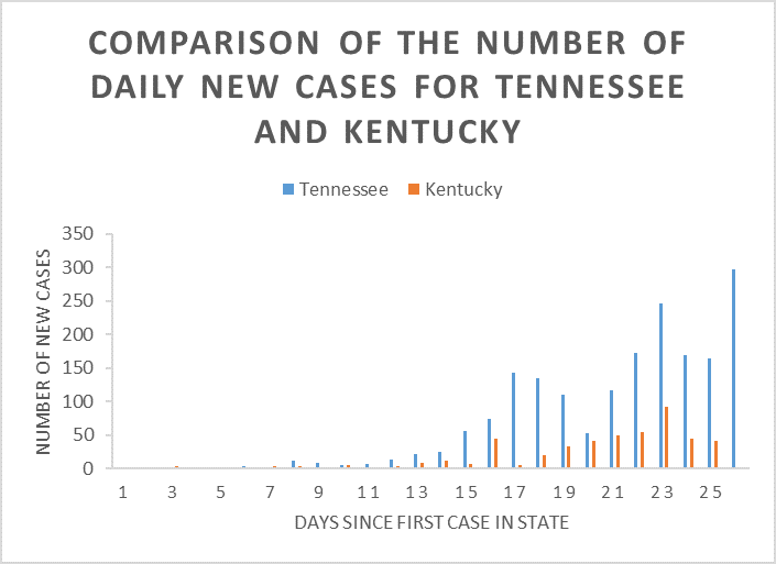
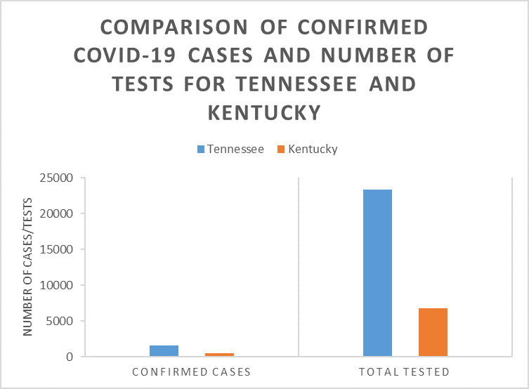
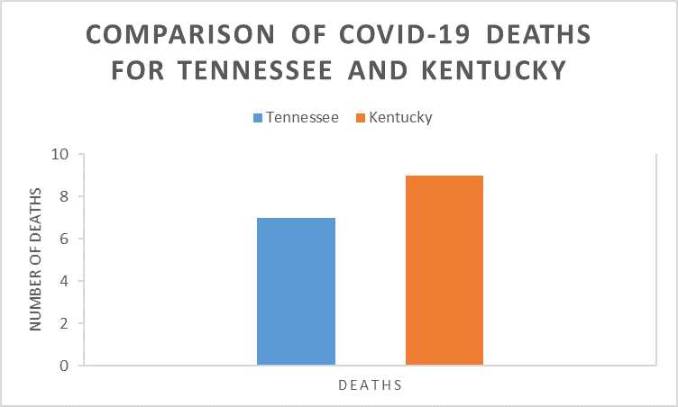
If we assume the rate of death from COVID-19 is similar for neighbouring states, we would expect states with a similar number of deaths to have a similar number of cases. Despite Tennessee reporting roughly three times as many confirmed cases as Kentucky (1,537 vs 480), these states had reported equivalent numbers of deaths (7 vs 9, though even the data on deaths can be misleading – see below). Looking closer, Tennessee had also done roughly three times as many tests (23,304 vs 6,810), which would indicate that if Kentucky did more testing they may uncover many more cases.
Another pattern that raises alarm bells is an overly consistent number of new cases every day. Rather than reflecting a flattening of the curve, it may indicate that testing capacity has been met and that is the maximum number of cases that are able to be reported in one day. This is thought to be what happened in Iran, with a spike expected due to an increase in testing capacity.
In the early stages of the outbreak in South Korea there was a huge spike in the number of cases of people in their 20s and women in particular. We puzzled over this until we realised the Korean authorities had tested all 200,000 members of a church associated with their biggest cluster of cases and they included many young and female members, and the segregated seating meant that the index case, a woman, had spread the virus mainly to other women.
There’s also variation in who gets reported as a confirmed case. For example, China hadn’t included asymptomatic-infected cases in their reported case numbers but is from now on. Many other countries are unlikely to have tested asymptomatic cases and it is worth remembering this when comparing data. In our own data for Aotearoa New Zealand we were counting confirmed cases (cases who tested positive) and probable cases (case who must have had COVID-19 because they passed it on) separately. Now, like many international sites, we have changed reporting criteria and include both in the total count.
There is variation in how COVID-19-related deaths are reported
Even comparing the number of deaths between different places isn’t as simple as it sounds.
As well as considering the age of the infected population (older people are more likely to die from COVID-19, so an older population may have a higher death rate) it’s also important to think about where the country is on their pandemic timeline. Some countries with an overwhelmed healthcare system will be experiencing higher rates of death than those that have not reached that point.
It’s also important to determine how COVID-19 deaths are being recorded. Some countries do post mortem testing for COVID-19 (e.g. Italy) and assign it as the cause of death if it is present while others are not doing this as a routine practice (e.g. Germany), which will create an artificial difference in mortality rates, especially once the healthcare system is overwhelmed and not everyone is being tested. Depending on how cause of death is recorded there would be very different rates of mortality associated with this infection – was the cause of death COVID-19 or did the person die of pre-existing health issues with COVID-19? Many people are dying with COVID-19, but not necessarily of COVID-19 and people account for this subtlety differently in their reporting.
Apply a healthy dose of scepticism
The data we are using is as reliable as we’ll get during this rapidly evolving situation and it is a vital proxy for the actual number of cases that we have. But we have to allow for its foibles. Take a breath and ask a few questions before leaping to conclusions when comparing one country to another. In Aotearoa New Zealand, our next challenge is to upscale our testing to fully understand the number of cases we have missed so far.
This post has been republished with permission on the New Zealand Herald website.